Unfortunately, the passage of time and the unwillingness of previous generations of designers to be shackled with uncomfortable restraints has lead to many of the current crop of designers being unaware of Mr Wheildon's very conclusive "guidelines."
But if there is information or content in your communication piece, on the web or in print, that you'd like read, it's probably worth knowing some of his very revealing findings. If the words aren't important, go right ahead and treat them as a "design element".
However, the study I'm going to talk about here is one that most graphic designers haven't heard about or, if they have, try to avoid its limiting conclusions or more often dismiss the research as being out of date.
Colin Wheildon's "Communicating. Or Just Making Pretty Shapes" looked at a range of issues for print communication. The study was conducted over 7 years from 1982 to 1988 with additional material on headlines added in 1990.
It was undertaken specifically because there was no hard data in the area. Even though it is limited to print I can find nothing to invalidate it - people's eyes haven't changed in 25 years just as the laws of gravity haven't changed in over 300.
I only want to look here at two issues Wheildon addressed - the treatment of colour in headlines and text copy (there are numerous other points, such as font readability which I'll look at in coming issues).
Use of Colour in Headlines:
Key conclusion:
High chroma headlines (hot red, bright green, orange) were the most attractive because it drew respondents attention to the text.
However:
But, black was best of the lot.
This doesn't mean there should be a blanket ban on colour headlines. But there should be an informed balance between attraction and comprehension. Our own most recent issue of {The Paper} used a high chroma headline (warm read on uncoated stock) but because of strength of the type treatment we decided it worked really well and added to the communication rather than detract from it.
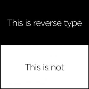
Coloured and Reverse Text
Nowhere was the difference between art and communication more at odds than in looking at the comprehension of coloured and reverse text.
Key conclusion: It doesn't come down to just an issue of contrast, more that there should be a darker text and a lighter background.
Black on white had 70% good comprehension, white on black had... 0%!
Wheildon's work is still highly regarded. I was reminded of this by my good friend (and legendary B2B direct marketer) Ruth P. Stevens in New York a couple of years back when we were chatting about what makes effective direct marketing design. Being the direct marketing guru she is, I was impressed that she would accord it such weight. As we are all aware, Direct Marketers live and die by "the numbers!"
Just because we have the means doesn't mean we have the skills. And so it is with graphic design - a Bunnings in every suburb won't make me a carpenter or an electrician!
[Similar results for the reverse text research are referred to by Susan Trevellyan in a blog post in 2011. According to her research 45% of the population have a stigmatism which makes it difficult to read reverse type. That just about halves your audience. Oh, and we thought Susan Trevellyan's simple image juxtaposing black and reverse type communicated so well we thought we'd give it another airing ourselves as the image for this article.]
*"Communicating or Just Making Pretty Shapes" Colin Wheildon, 1990 Newspaper Publishing Bureau.